Marks & Spencer
First time on mobile for one of the world’s premium retail experiences
Strategy
UX/UI Design
Front-End Development
Server-Side Development
iOS Development
Android Development
QA Testing
The Challenge
Marks & Spencer recognized the need for a user-friendly app that mirrored the quality and inclusivity they’re known for in their stores. They wanted to create a seamless shopping journey – browsing from home or using the app while in-store. Accessibility for all demographics was a key priority, ensuring their loyal customer base wouldn’t be left behind.


Our Approach
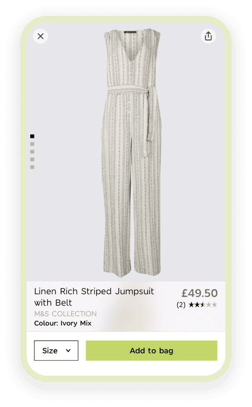
In close collaboration with M&S, we recognized that a one-size-fits-all approach wouldn’t work for their diverse clientele. Instead, we crafted a custom solution that was seamlessly integrated with M&S’s existing e-commerce system. This not only ensured a familiar experience for existing customers but also offered everyone the convenience of mobile shopping.
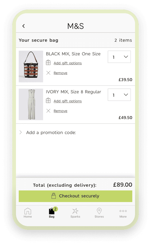
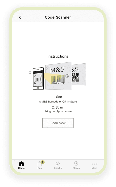
A core feature we implemented was the barcode scanner. This allowed users to seamlessly add items to their cart while physically in-store, without the need to navigate product categories. Additionally, the app personalizes offers based on past purchases, creating a curated shopping experience for each user.
Outcome
We’re proud that the M&S app offers a smooth shopping experience that caters to a wide range of users. The barcode scanner allows for effortless in-store shopping, while personalized recommendations ensure a relevant product selection. Most importantly, the app retains the welcoming feel M&S is known for, providing a comfortable transition to mobile shopping for its loyal customers.

