Hikotron
EV Charging in New Zealand, Made Better
Strategy
UX/UI Design
iOS & Android Development
Front-End Development
Server-Side Development
QA Testing
Introduction
Hikotron’s co-founders Ron Smits, Stephanie Smits O’Callaghan, and Lawrence Muijlwijk returned to New Zealand during the COVID-19 pandemic, bringing their experiences from Europe and an idea for better EV charging.
Coming back as EV owners, they quickly recognised a gap in the local EV charging market and saw an opportunity. What sets them apart is their commitment to building the charger hardware on their own to suit specific purposes. Their passion to support the acceleration of EV use across New Zealand led them to develop the technology using their combined experience and knowledge.
The Challenge
The Solution
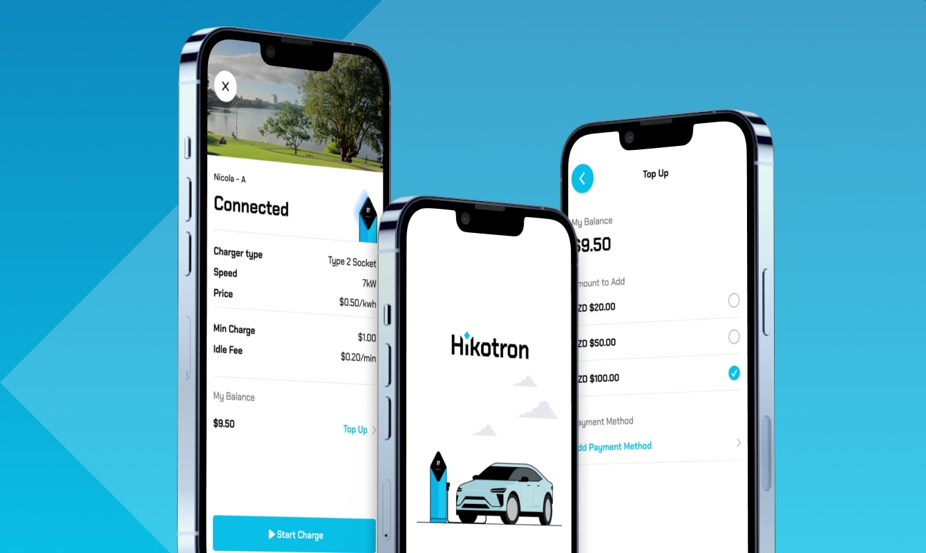
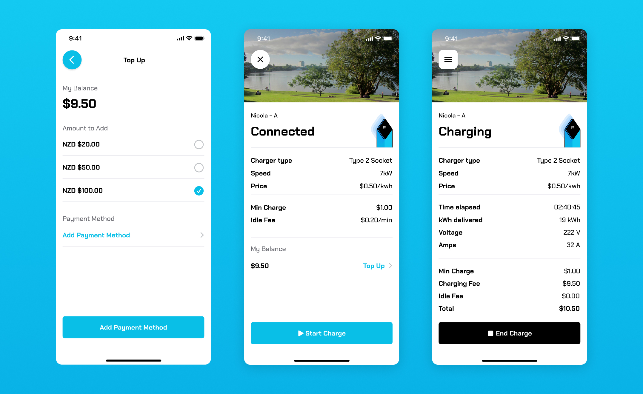
Our development team designed and developed a feature-rich mobile app, available on both iOS and Android platforms, to provide EV drivers with a smooth charging experience. Key features of the app included:
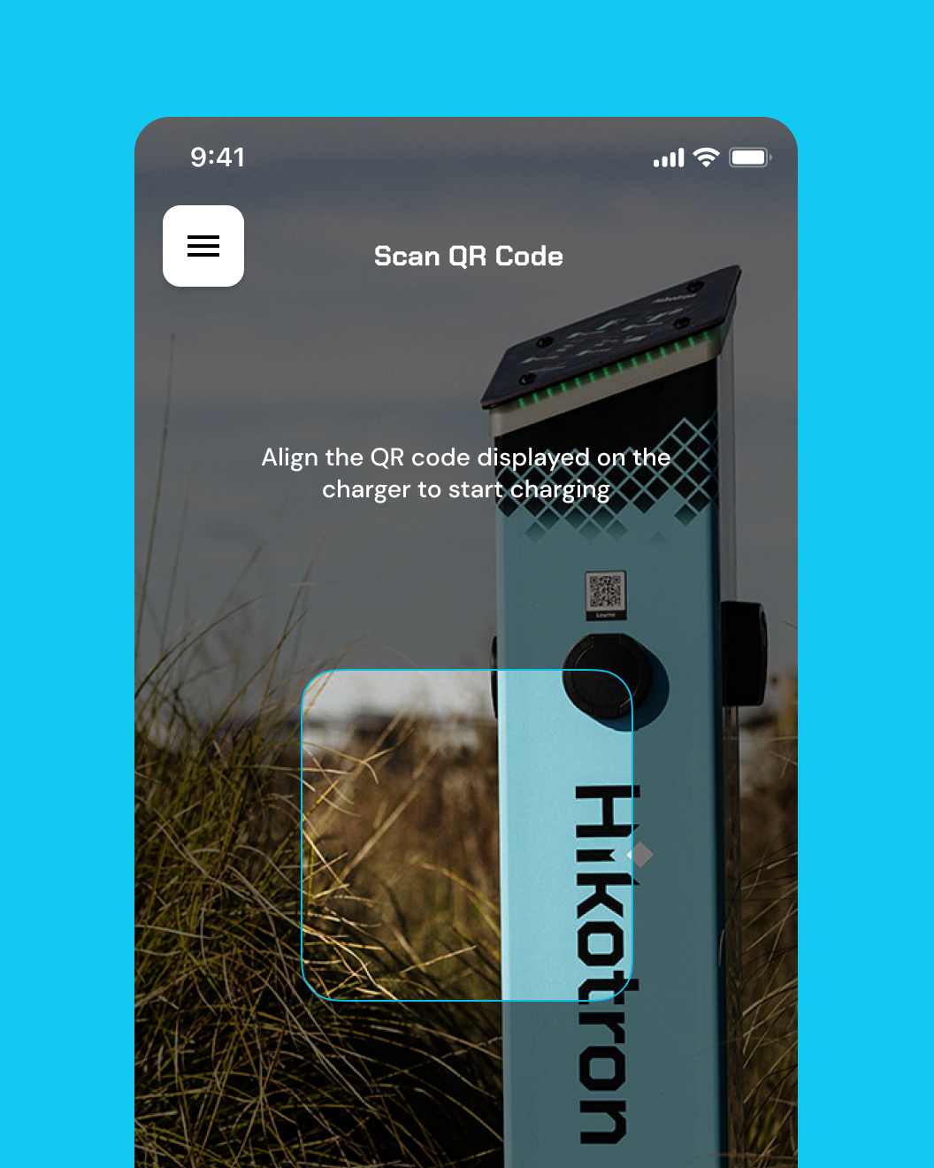
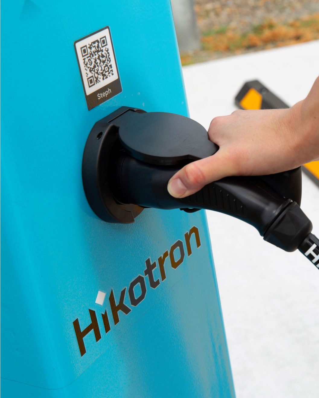
QR Code Scanning: To initiate a charging session, users simply scanned the QR code displayed on the charger using the app. This process eliminated the need for any physical cards or credentials, streamlining the user experience.
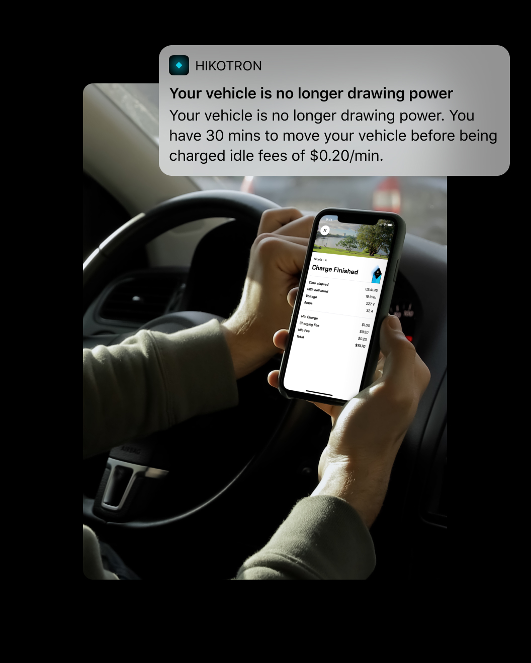
Charging Management: Once connected to the charger, users could easily start or stop the charging process through the app. Real-time power consumption data was displayed during the charging session, enabling users to monitor the charging progress.
Payment Integration: The app integrated multiple payment options, including credit/debit cards and in-app balance recharge, ensuring secure and hassle-free transactions.
Brand System Development
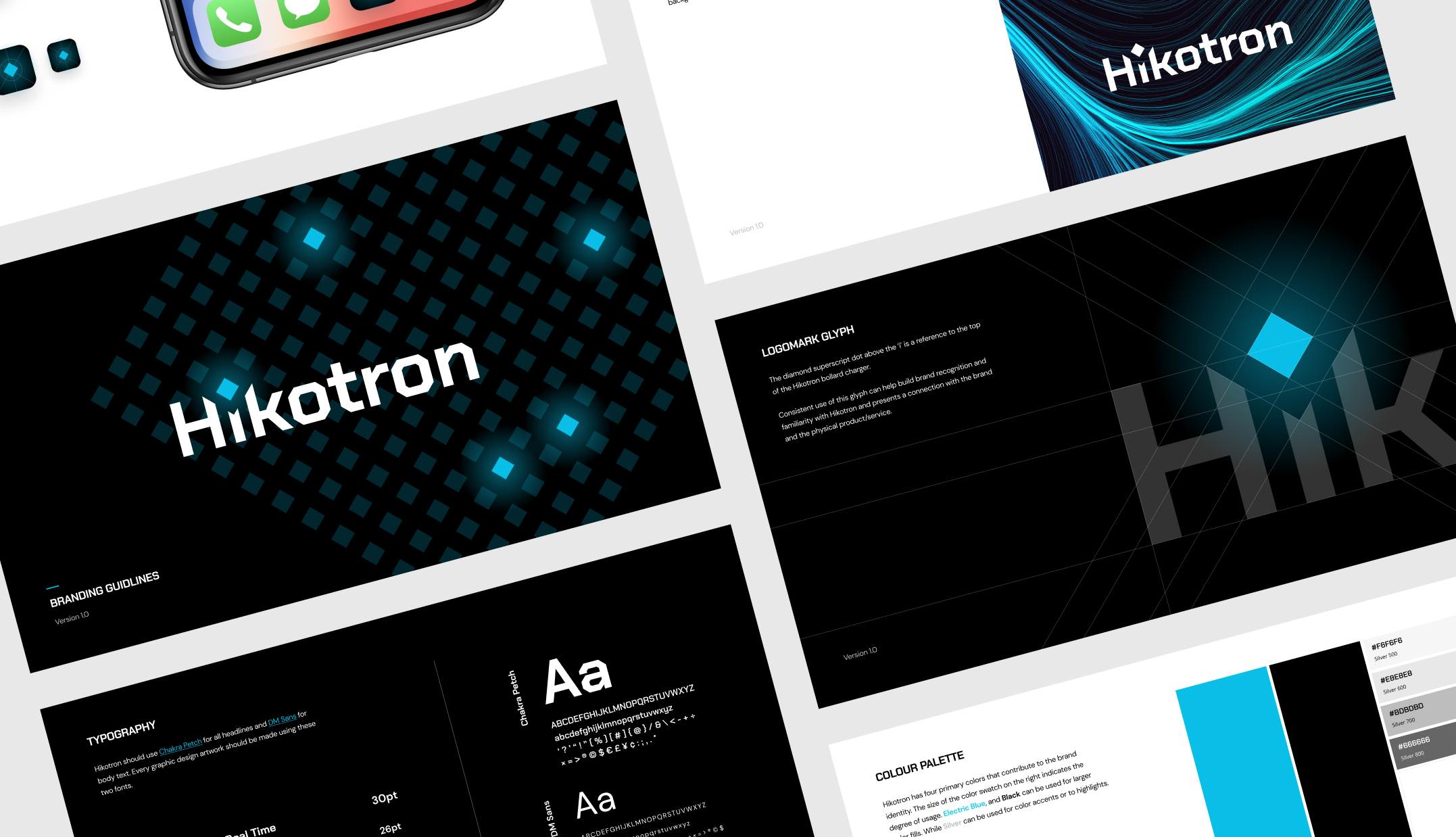
We designed a clean and modern logo that symbolizes the convergence of electricity and eco-friendliness. The logo featured an abstract representation of their EV charger, conveying Hikotron’s core focus.
Results and Impact
The Hikotron brand system enhanced the company’s overall presence, creating a strong and consistent brand identity across all touchpoints. The logo, logomark glyph, and app icon became instantly recognizable, fostering brand loyalty among users and setting Hikotron apart from its competitors.

